
|
|
|
|
Hello, everybody.
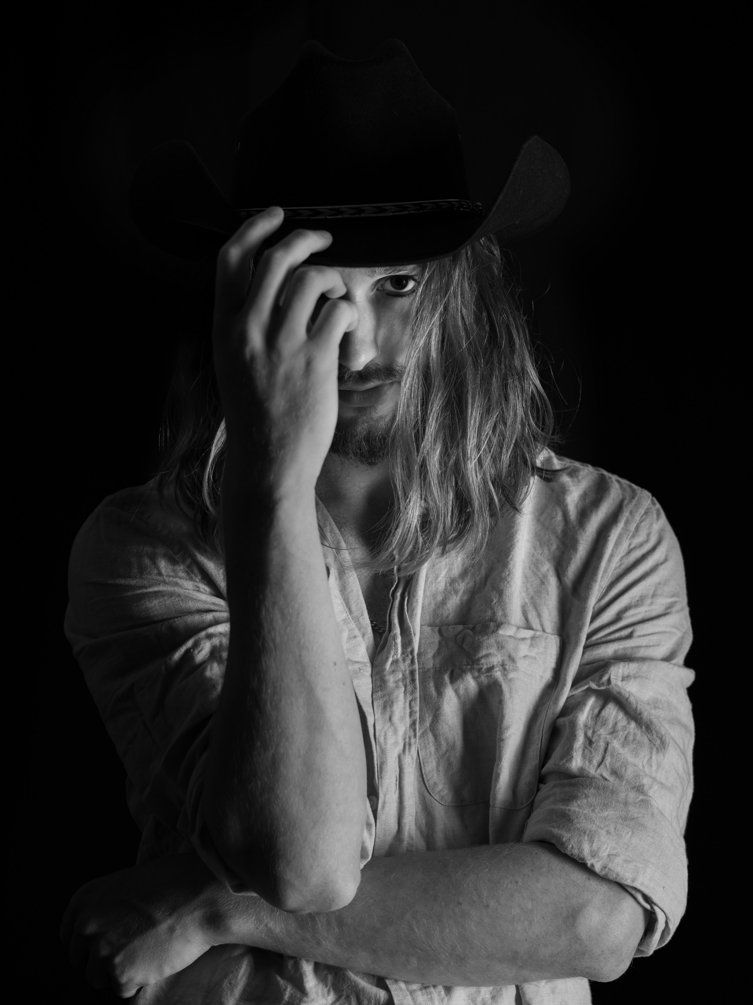
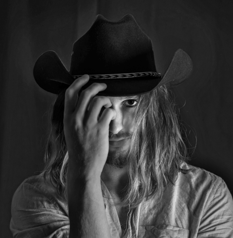
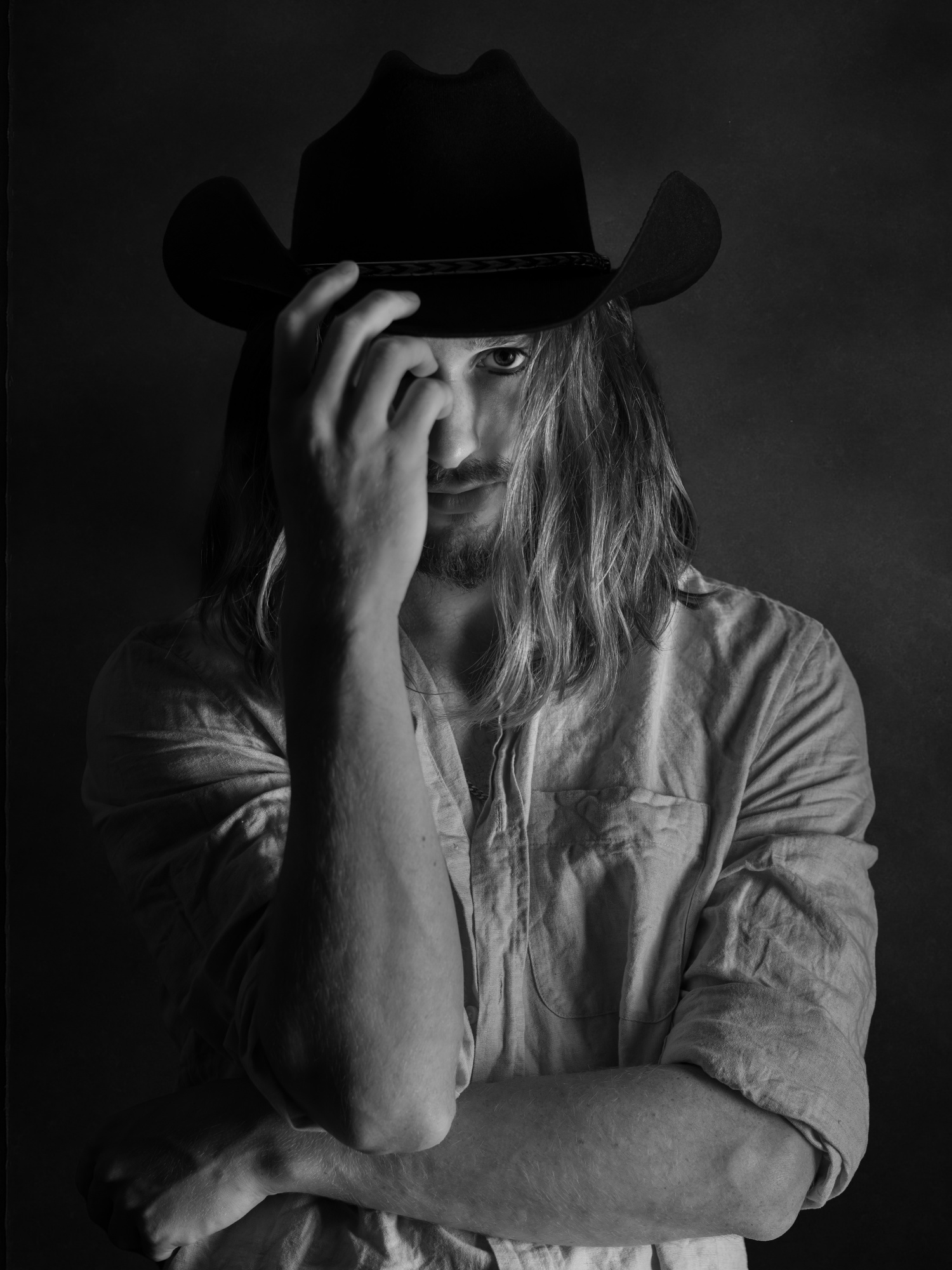
I've been quite amazed at having this photo scoring the lowest value possible in curation, 1% in all charts.
I am not mad at it; there is no problem at all. What I want simply is knowing what am I missing here, as I really like the shot. :)
I posted the first photo on the site and it received a low score. In the second photo, I separated the background from the figure more, in order to also show the hat.
Any advice will be appreciated. Please feel free to share your honest view on this shot.
Thank you in advance for your help!
Hi Svetlana,
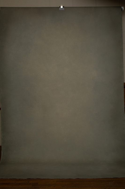
The issue for me is that there isn’t enough separation between the subject and the background. I pulled it into Photoshop and raised the midtones all the way up, but there just isn’t enough information there to recover detail.
When shooting black on black, like the hat and background here, you really have to place a light between them or bounce light back onto the background to give a little dimension. That subtle separation is what makes the subject read cleanly and adds depth to the image.
It’s a strong concept, and with just a bit of light control, it could really shine.
All the best,
Tammy
Senior Critic
Svetlana,
Welcome back to Critique Forum. Thanks for sharing this portrait with us.
Regarding percentage scores. Many members are frustrated by them. They seem at times to be illogical as if the algorithm has 'run amuck'. One solution is to ignore them and the pie charts and comments as well. The photos in your gallery testify that you are a capable photographer. I'm sure you know a good photo when you see one or make one yourself. The Curation process is not perfect at 1X. We do not know how many members vote, who they are, how experienced they are, how quickly they vote, and so on. If you were to post again the results would likely be different because it would be a new group of members voting.
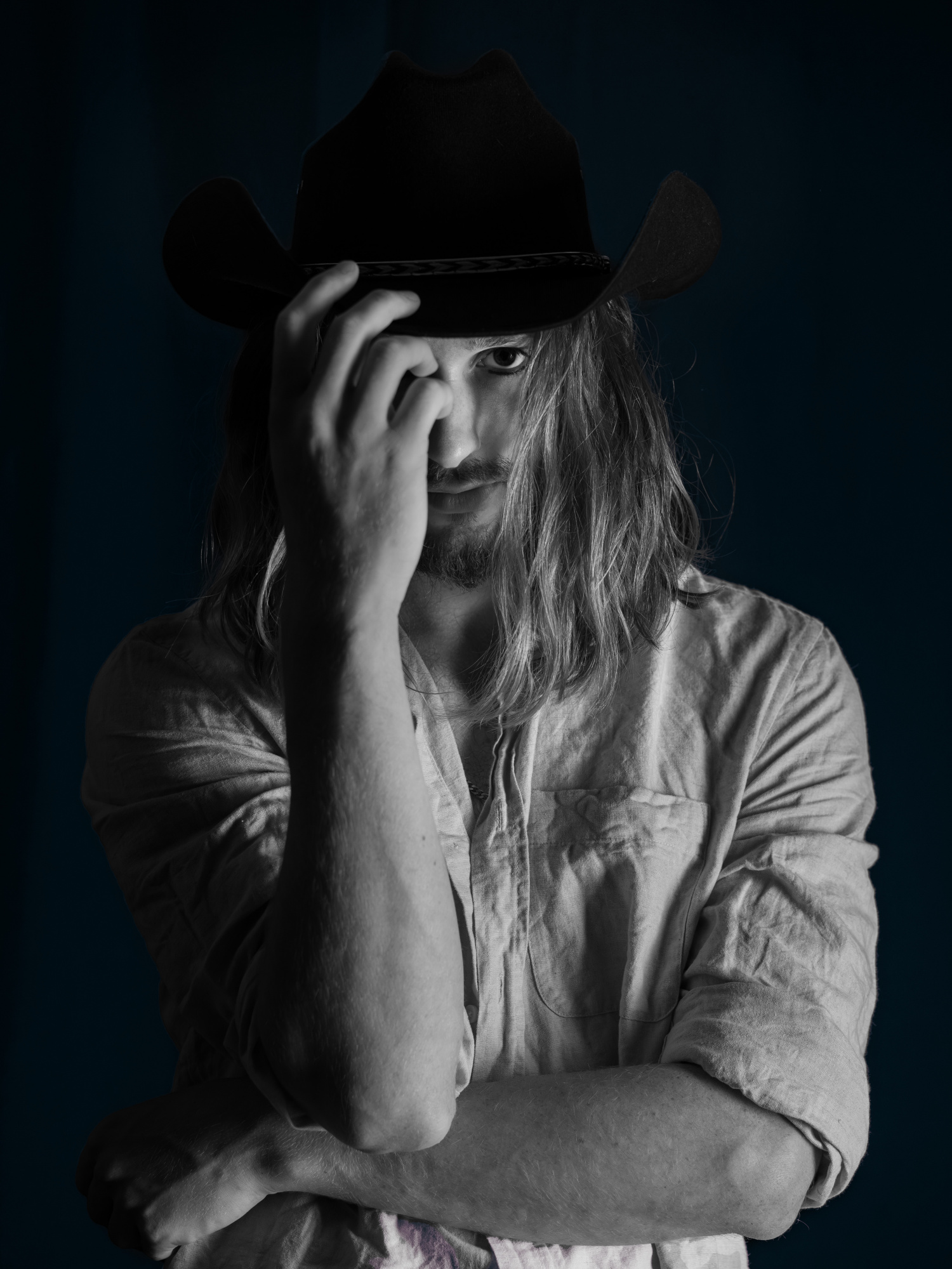
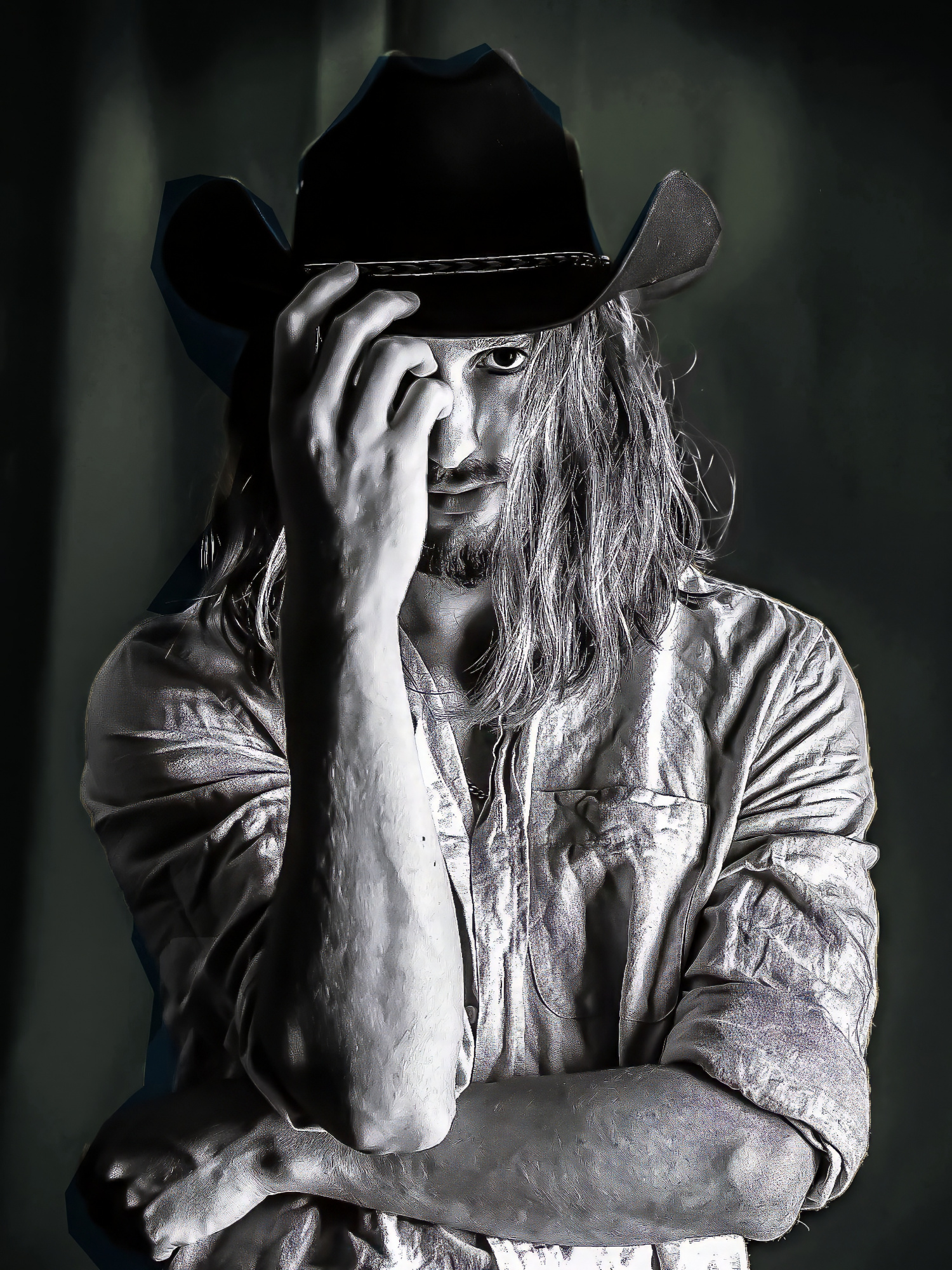
Anyway, the photo . . . . The black hat blending into the black background is dramatic, but if there were a bit of separation I think it would be better. For the sample edit I used Photoshop's 'Image>Adjustments>Shadows/Highlights' tool. That made the background lighter, but a blue tone came out so I converted the image to black and white with 'Image>Adjustments>Black and White' at the Default settings.
Your model's left arm and hand seemed a bit awkward so some cropping was used. The direct and intense gaze may be made even stronger with a closer crop.
The highlights were toned down so that the face is the brightest part of the image. Bright areas tend to distract viewers' attention.
Suggestions only. I'm not a portrait or lighting expert.
. . . . . Steven, senior critic

Dear Svetlana,
Thanks for submitting your photo to the critique forum.
Tammy and Steven have pointed out to what seems to be the reason for achieving such a low score – the merging of the man with the background, so, I took your photo to Photoshop using Camera Raw filter trying to separate the man from the background, so he is becoming the focal point. I also upscaled the image and finally, I took it to Topaz AI and reduced the noise and increased the sharpness.
Hope you like it.
Best regards
Arnon Orbach Senior Critic
Hi Svetlana,
I’ve been following the conversation on this one, and I think you’ve got something really special here. After looking at the other edits, I kept wondering what would happen if the background were replaced rather than lifted. I tried it, and it completely changed the mood. It gave the portrait that clean, modern Calvin Klein kind of feel while still keeping the quiet confidence that makes it yours.
The new background shifts the attention in a really natural way. It feels more cohesive now, and the mood carries beautifully through the frame. I’m attaching the background I used, it’s a shot of one of my own drops, for you to try out. After swapping, it looked a bit flat, so I painted in light and shadow using curves to give it some depth.
All the best,
Tammy
Senior Critic
Sveltana,
I was also working on this picture. I made him first a little bit lighter to become more contour and did select subject after this i turned the selection and gave a new background. After this I worked on the light. Not a better one but only another look. Theo L. senior critic
Светлана,
Добро пожаловать на форум «Критика». Спасибо, что поделились с нами этим портретом.
Что касается процентных оценок. Многие участники разочарованы ими. Иногда они кажутся нелогичными, как будто алгоритм «сошел с ума». Один из вариантов — игнорировать их, а также круговые диаграммы и комментарии. Фотографии в вашей галерее свидетельствуют о том, что вы талантливый фотограф. Уверен, вы узнаете хорошую фотографию, когда увидите её или сделаете сами. Процесс курирования в 1X не идеален. Мы не знаем, сколько участников голосуют, кто они, насколько они опытны, как быстро они голосуют и так далее. Если бы вы опубликовали пост снова, результаты, вероятно, были бы другими, поскольку голосовать будет другая группа участников.
В любом случае, фотография... Чёрная шляпа, сливающаяся с чёрным фоном, выглядит драматично, но, думаю, если бы было немного разделения, было бы лучше. Для примера я использовал инструмент Photoshop «Изображение > Коррекция > Тени/Света». Это сделало фон светлее, но появился синеватый оттенок, поэтому я преобразовал изображение в чёрно-белое с помощью инструмента «Изображение > Коррекция > Чёрно-белый» с настройками по умолчанию.
Левая рука и кисть вашей модели показались немного неуклюжими, поэтому пришлось немного кадрировать. Прямой и пристальный взгляд можно сделать ещё выразительнее, если кадрировать ближе.
Светлые участки были приглушены, чтобы лицо стало самой яркой частью изображения. Яркие области, как правило, отвлекают внимание зрителя.
Только предложения. Я не эксперт по портретной съёмке и освещению.
. . . . . Стивен, старший критик
Привет, Светлана!
Проблема для меня в том, что нет достаточного разделения между объектом и фоном. Я перенёс его в Photoshop и максимально поднял средние тона, но там просто недостаточно информации, чтобы восстановить детали.
Снимая чёрный на чёрном, например, шляпу и фон, нужно обязательно разместить между ними источник света или отразить свет обратно на фон, чтобы придать ему объём. Именно это тонкое разделение позволяет чётко видеть объект и добавляет глубину изображению.
Это мощная концепция, и с помощью небольшого управления светом она может по-настоящему засиять.
Всего наилучшего,
Тэмми,
старший критик
Thanks for the suggestion. I liked the idea. Making a cut without a hand really changes and brings the character closer and highlights the look.
My idea for the photo was that a character comes out of the darkness and highlights the character with the help of the model's hands. But I see that everyone wants to separate the model from the background. So my idea is probably less suitable
